L MONOCLE
Monocle events and promotions
Monocle Radio
Featured podcasts and chapters
Latest Podcasts
Monocle Films
Latest Films
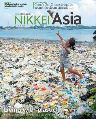
Monocle magazine
Free to read in this issue
Monocle Shop
Featured categories and collections
Subscribe to the Monocle newsletters
Sign up to Monocle’s email newsletters to stay on top of news and opinion, plus the latest from the magazine, radio, film and shop.